American Chemical Society
Learning Module Redesign


My Role
UX/UI design
Contributions
UI Audit
Agency
iFactory
Duration
5 months
Wireframes
Art direction
Prototype
User Testing
Tool
Figma
Our goal was to create a learning module that was fun, engaging, and informative. We faced a big challenge in creating this module due to the client framework’s (Articulate Storyline) tight restrictions around screen sizes and lack of scrolling capabilities. To address this, we started the process by auditing the client’s existing modules and researching how other learning modules and game applications solved similar problems.
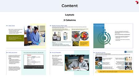
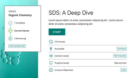
We provided the client with specific templates for different content types. The templates facilitated consistent designs which helped address the recurring problem of tight space restrictions. We designed the UI to be technical and minimal, but still welcoming with inviting colors and rounded corners.
This project is currently in the user testing phase and we are still designing additional components. The module is schedule to launch in 2024.
01
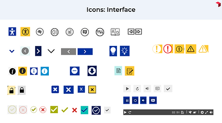
I began the project by conducting a user interface (UI) audit of their existing modules. I discovered inconsistencies in every element, from the smallest icon to the overall page layout.

02
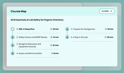
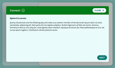
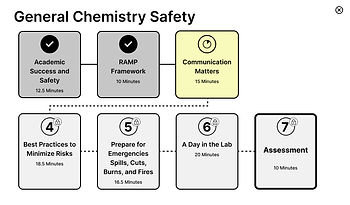
The next step was to start wireframing. I took on the challenge of how to present the course map and multiple choice questions in a way that was both informative and engaging. I found inspiration from game apps, which often use a clear and concise visual style to help users navigate through the content in a limiting space.


03
For the art direction, I chose to use a clean and minimal style with two colors, sharp lines, and minimal icon design.

04
The client wanted to combine two art directions in the final design, taking my sharp lines and minimal icons with another designer's direction that took a softer approach.